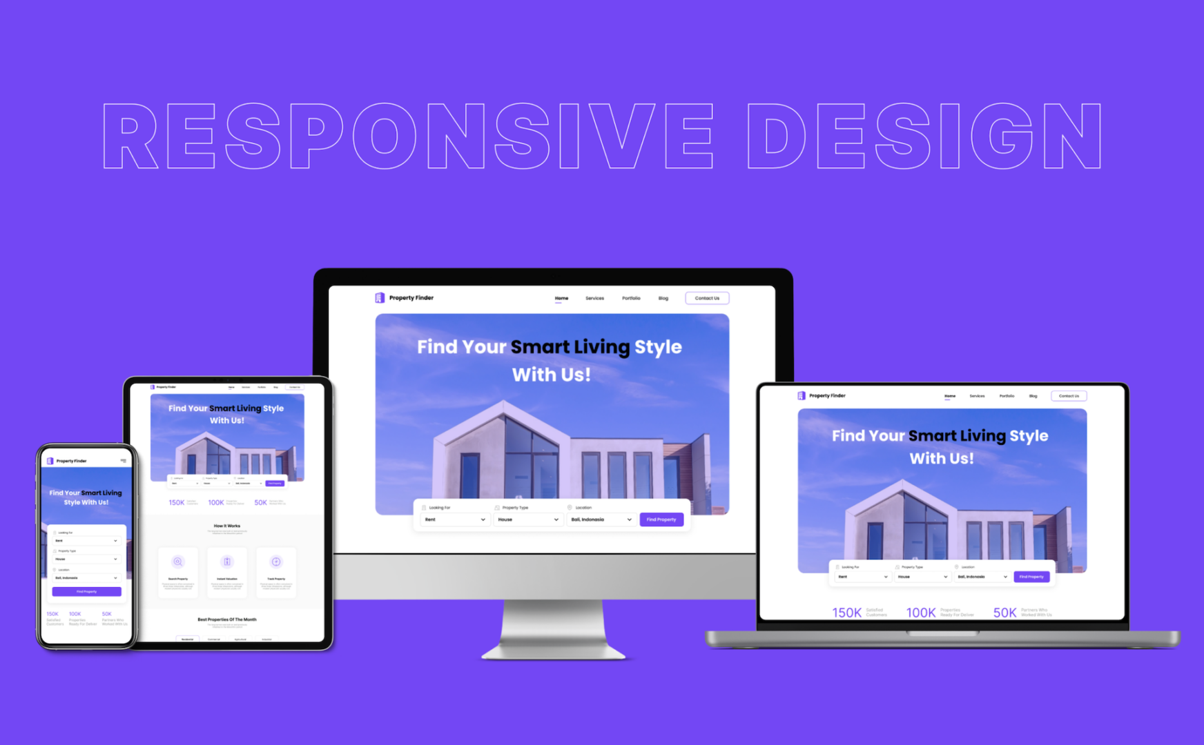
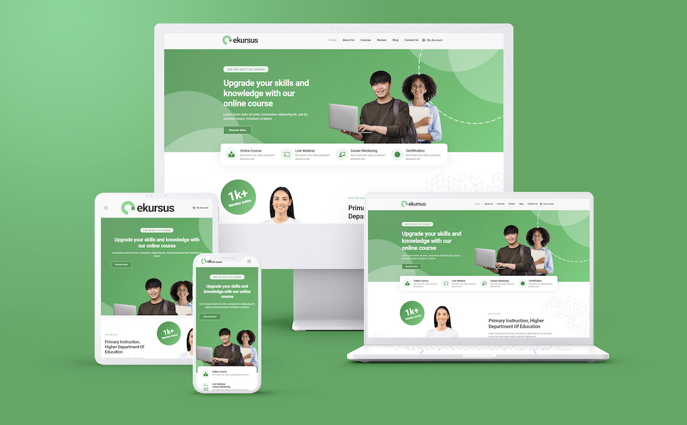
What is Responsive Design
Responsive design is an approach to web design that aims to create web pages that adjust and adapt to various screen sizes and devices. It ensures optimal user experience irrespective of the device used, whether it’s a desktop, tablet, or mobile.
The Art of Responsive Design
In the dynamic digital landscape, where users seamlessly transition across an array of devices, Responsive Design emerges as the architectural marvel ensuring a harmonious user experience. Join us on an exploration into the realm of Responsive Design, unraveling its process overview, sample use cases, and real-world case studies that showcase its transformative power in crafting adaptive and user-centric digital environments.
Process Overview: Weaving Seamless Adaptability
Objective: Responsive Design aims to create digital interfaces that effortlessly adapt to various screen sizes and devices, providing users with a consistent and optimal experience regardless of how they access the content.
Key Stages:
Research and Analysis
Understand the target audience and their device usage patterns.
Analyze existing digital assets to identify areas for improvement in terms of responsiveness.
Explore industry trends and best practices in Responsive Design.
Wireframing and Prototyping
Create wireframes that outline the structure and layout of the responsive design across different screen sizes.
Develop interactive prototypes to visualize the user experience and functionality on various devices.
Seek feedback from stakeholders to refine the design before implementation.
Fluid Grid Layouts
Implement a fluid grid layout system that allows content to proportionally adjust to the screen size.
Utilize relative units like percentages for widths and heights to ensure flexibility.
Prioritize content hierarchy for effective presentation on smaller screens.
Media Queries
Integrate media queries to apply specific styles based on the characteristics of the device, such as screen width, resolution, and orientation.
Optimize images and other media assets to enhance performance on different devices.
Leverage breakpoints to define where the design should adapt to accommodate various screen sizes.
Cross-Browser Testing
Conduct thorough testing across different browsers to ensure consistent rendering.
Identify and address any compatibility issues that may arise on specific browsers or devices.
Utilize testing tools to simulate different device environments.
Optimization and Performance
Optimize code and assets to enhance page loading speed on diverse devices and network conditions.
Implement lazy loading for images and prioritize critical content for faster rendering.
Continuously monitor and refine performance based on user feedback and analytics.
Key Components:
Responsive Images
Implement responsive image techniques, such as using the “max-width” property, to ensure images scale appropriately.
Utilize the “picture” element and “srcset” attribute for delivering different image versions based on device characteristics.
Mobile-First Approach:
Embrace a mobile-first design philosophy, starting with the smallest screen size and progressively enhancing the design for larger screens.
Prioritize essential content and functionalities to create a streamlined mobile experience.
Accessibility Considerations:
Ensure that the responsive design adheres to accessibility standards.
Implement features like scalable fonts, proper color contrast, and keyboard navigation to enhance usability for all users.
Sample Use Cases: Crafting Seamless Experiences Across Devices
E-commerce Platform:
- Objective: Enhance the user experience of an e-commerce website across desktops, tablets, and smartphones.
- Responsive Design Features: Fluid grid layouts, optimized images, and breakpoints for different screen sizes.
- Outcome: Users enjoy a consistent shopping experience, with intuitive navigation and easy access to product information regardless of the device.
News and Media Website:
- Objective: Deliver news content in an accessible and engaging manner across a diverse audience.
- Responsive Design Features: Mobile-first approach, adaptive layouts, and optimized media queries.
- Outcome: Readers can seamlessly access news articles, images, and videos on various devices, promoting user engagement.
Corporate Landing Page:
- Objective: Create a professional and informative landing page for a corporate website.
- Responsive Design Features: Mobile-first design, fluid grid layouts, and optimized typography.
- Outcome: The landing page adapts gracefully to different screens, presenting the company’s brand and message consistently.
Educational Learning Platform:
- Objective: Facilitate online learning experiences across laptops, tablets, and smartphones.
- Responsive Design Features: Adaptive layouts, interactive elements, and optimized media.
- Outcome: Learners have a seamless experience accessing course materials and participating in activities on a variety of devices.
Case Studies: Responsive Design in Action
The Guardian:
- Challenge: The Guardian, a renowned news platform, faced the challenge of delivering news content across diverse devices.
- Responsive Design Implementation: Adopted a responsive design strategy with fluid layouts and adaptive media queries.
- Outcome: The Guardian witnessed a significant increase in mobile traffic, with users enjoying a consistent and user-friendly news reading experience.
Bootstrap Framework:
- Challenge: Bootstrap, an open-source front-end framework, aimed to provide developers with a responsive grid system.
- Responsive Design Implementation: Bootstrap introduced a responsive grid system, predefined classes for different screen sizes, and a mobile-first approach.
- Outcome: Developers embraced Bootstrap for building responsive and mobile-friendly websites, contributing to its widespread adoption.
Airbnb:
- Challenge: Airbnb sought to enhance the user experience for hosts and guests accessing the platform on various devices.
- Responsive Design Implementation: Implemented responsive design principles, including fluid grids and adaptive layouts.
- Outcome: Airbnb achieved a consistent and visually appealing experience across desktops, tablets, and smartphones, resulting in increased user engagement.
Navigating Challenges: Maximizing the Impact of Responsive Design
To ensure the optimal impact of responsive design, organizations should address common challenges:
Performance Optimization
Overcome challenges related to performance by continually optimizing assets, minimizing HTTP requests, and leveraging browser caching.
User Testing Across Devices
Navigate challenges by conducting extensive user testing on a variety of devices to identify and address any usability issues.
Browser Compatibility
Address challenges related to browser compatibility by staying informed about browser updates and promptly addressing any rendering issues.
Content Prioritization
Overcome challenges related to content prioritization by collaborating with stakeholders to identify essential content and features for each screen size.
Shaping the Future of Digital Experiences
Responsive Design is the compass guiding digital experiences into a future where adaptability reigns supreme. Through a meticulous process overview, sample use cases, and real-world case studies, we’ve delved into the transformative power of Responsive Design—from revolutionizing news consumption on The Guardian to elevating the user experience on Airbnb.
As the digital landscape continues to evolve, Responsive Design stands as the cornerstone of user-centricity, ensuring that every interaction is seamless, engaging, and optimized for the diverse devices that shape our connected world. It’s not merely a design philosophy; it’s a commitment to crafting digital environments that effortlessly adapt, providing users with an experience that transcends screens and resonates with the fluidity of modern lifestyles.

Importance
Accessibility: Ensures accessibility across different devices and screen sizes.
SEO Benefits: Google favors responsive sites for mobile searches.
Enhanced User Experience: Provides a consistent and user-friendly experience.

Your Business Benefits
Wider Reach: Reaches users across different devices and platforms.
SEO Advantage: Improves search engine rankings due to mobile-friendliness.
Streamlined Maintenance: Easier to maintain a single responsive site than multiple versions.
Your Business Strategies
Mobile-First Approach: Design with mobile users as a primary consideration.
Testing Across Devices: Test across various devices to ensure consistent experience.
Fluid Grids and Images: Use flexible grids and images to adapt to different screens.

