Ambrosia
B2B Organic food & drink supplier for the US market
Project name: Ambrosia
Launch date: march, 2014
Our challenge
Ambrosia came to us in search of a cohesive brand message & compelling digital presence. Working closely with the company’s founders, we were able to capture the essence of their vision, help them convey Ambrosia’s unique story and spread the word about their superior products. We accomplished this by establishing a unified brand message across all channels that highlighted the quality of the products sold on their platform, which are all DOP and GDP certified. Ensuring the message will get across all touchpoints.
Our approach
The first goal of our new collaboration was to understand both the brand as well as the buying habits of Ambrsia’s customers. With this objective in mind, we created a robust platform. The information we gathered led to insights that allowed us to create Ambrosia Italy’s brand, as well as coming up with highly engaging visual content to make their story more compelling and highlight their values.

The process
Creating the UX/UI for Ambrosia Italy, a B2B supplier for the US market, involved a systematic approach that focused on simplicity and usability. The goal was to design an intuitive and efficient interface that would enhance the user experience and enable seamless interaction with the platform.
The process of creating the UX/UI for Ambrosia Italy can be outlined as follows:
-
Research and Understanding: The initial step involved conducting thorough research to understand the target audience, their needs, and pain points. This included studying similar B2B platforms in the US market, analyzing user feedback, and conducting user interviews or surveys. This research helped the design team gain insights into the expectations and requirements of potential users.
-
User Flows and Information Architecture: With the knowledge gained from the research, the team mapped out user flows to identify the different steps and interactions users would have with the platform. This allowed them to create an efficient information architecture that organized content and features in a logical and intuitive manner. The goal was to make it easy for users to navigate and find the information they needed.
-
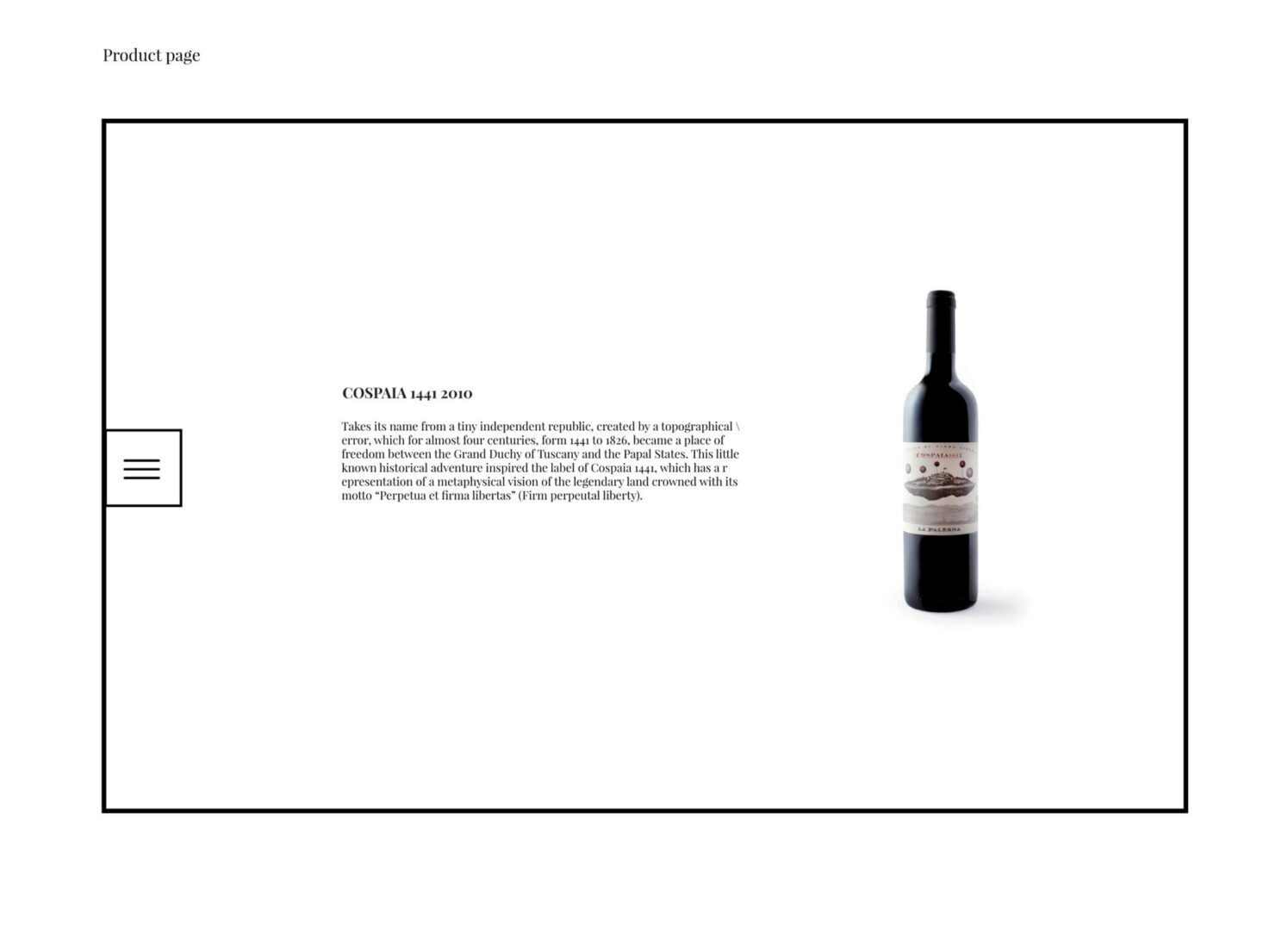
Wireframing and Prototyping: Using the insights from the user flows and information architecture, the team created low-fidelity wireframes to outline the layout and structure of the interface. This allowed them to focus on the placement of key elements and the overall flow of the user experience. After iterating and refining the wireframes, the team moved on to creating high-fidelity prototypes that provided a realistic representation of the final product.
-
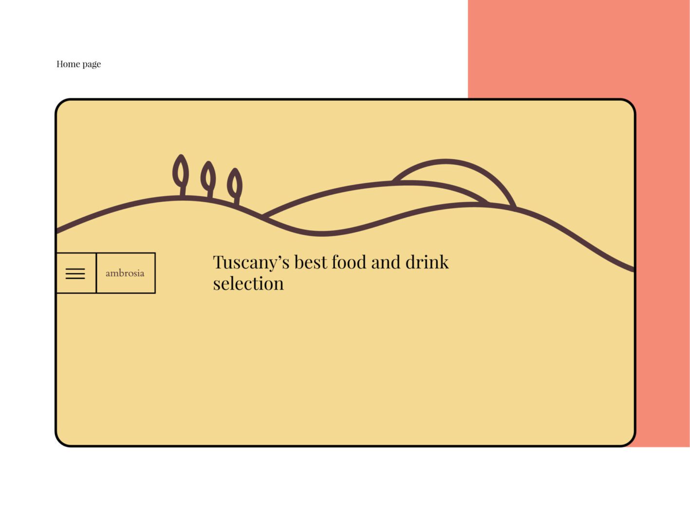
Visual Design: The visual design phase involved creating a visually appealing and consistent interface that aligned with the brand identity of Ambrosia Italy. The team focused on creating a clean and minimalist design that emphasized simplicity and clarity. The color scheme, typography, and visual elements were carefully chosen to enhance readability and guide users’ attention to important information.
-
Usability Testing and Iteration: Once the initial prototype was ready, the team conducted usability testing sessions with potential users. This involved observing how users interacted with the interface, identifying pain points or areas of confusion, and gathering feedback on their overall experience. Based on the findings, the team iterated on the design, making necessary adjustments to improve usability and address any usability issues or challenges that arose.

The prototype
Challenges Encountered:
-
Balancing Complexity and Simplicity: One of the main challenges was finding the right balance between providing comprehensive functionality and keeping the interface simple and user-friendly. The team had to carefully prioritize features and information to avoid overwhelming users with unnecessary complexity.
-
Aligning with Local Market Expectations: Adapting the B2B platform to cater to the specific needs and expectations of the US market posed a challenge. It required understanding the cultural and business context, such as industry standards, local user preferences, and compliance requirements, to ensure the platform was relevant and effective.
-
Maintaining Consistency: As the platform grew and new features were added, ensuring consistency in the UX/UI design became crucial. The challenge was to maintain a coherent and cohesive experience across different sections of the platform, while accommodating evolving requirements and user feedback.
In conclusion, simplicity and usability were key considerations throughout the creation of Ambrosia Italy’s UX/UI. By conducting thorough research, mapping user flows, and emphasizing clarity in visual design, the team aimed to provide an intuitive and efficient platform for B2B users. Iterative testing and addressing challenges along the way ensured the final product met the needs of the target audience and delivered a seamless user experience.

Results
Ambrosia Italy is becoming a household name and the go-to food & drinks broker for Italian products in the U.S. We’ve created Amrbrosia brand and digital presence. The web experience is been proving successful by significantly increasing on-site user visits and at the same time cutting down on the bounce rate.

